This image shows the final product for my music magazine front cover. Several things have changed from the layout I had previously created; however the majority of things have stayed the same.
I decided to call my magazine “connected” as I thought this would be the most suitable title. The name “connected” links with the idea of musical instruments being connected to amplifiers, and the artists themselves being connected with their fans. I placed the headline at the top of my page in the centre where it will be most noticeable; this is a typical convention of a magazine. I used a bold font, which I downloaded from 1001freefonts.com. The website had lots of fonts to choose from but I chose one which I knew would stand out. I used a deep purple colour for my masthead as it is neutral colour. Although it is slightly more associated with females. My magazine is aimed at females however males may want to read the music magazine as well so it was important for me not to use a colour such as pink.
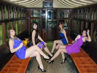
The picture is the main focus of my front cover, which is another convention of music magazines. I wanted to pick a picture for my front cover where the models had the masks on so that they were hidden behind them and their identities still unknown. This would entice the target audience to buy the magazine to find out who the girl band are. The image I used was originally in colour however after looking at other images of different girl groups in my research, I decided to make my picture black and white and leave the dresses and masks in colour so they stood out. I edited my photo in Photoshop; I added another layer to make it black and white then rubbed out the parts I wanted in colour. I believe my image works very well on the front cover, it stands out especially due to the fact that only some of the photograph is in colour.
My main headline is in colour so that it stands out compared to the rest of my headlines which are in black and white. “Masquerade revealed” links in with the fact that my models are wearing masks to hide their identity. I placed it more towards the bottom of the page but in the centre, so that it went across my image but not right through the centre of it as this would distract attention from the main focus of the image. I chose an older more fancy style font so that it linked in with the masquerade theme. I used a pale blue colour as blue and purple work well together, however I could not use a dark blue as this with blend in too much with the blue from the dresses and would not stand out as much. Underneath my main headline I have a sub headline “The truth behind the masks” this informs the target audience that inside the magazine all will be revealed.
My other headlines are in black and white, they are still noticeable but do not stand out as clearly as my main headline. I did not place them where I said I would on my layout. In my layout I placed them both down the left hand side of my magazine, however when it came to creating my magazine I realised this would not be possible as it would cover the centre of main image if I placed them down one side. Therefore I put one on either side so that the headlines fitted around the image.
Also on my front cover I have included a barcode, issue number, date, price and website. They are all small in comparison to the rest of the things on my page however they are only there to help make my magazine more professional and realistic so therefore it doesn’t matter if they don’t stand out as much as everything else. Overall I think my front cover is very effective; the picture and headline stands out how I wanted them to as does the masthead. I believe my magazine would attract the attention of my target audience. The headlines used are interesting ones and would entice audiences to want to read on.


